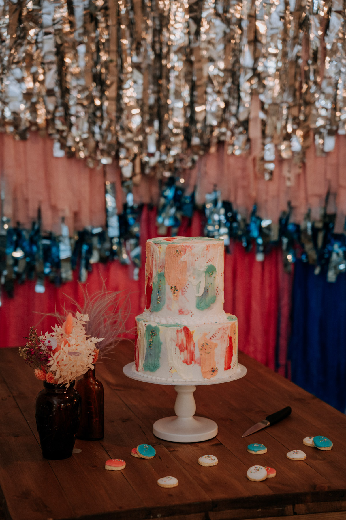
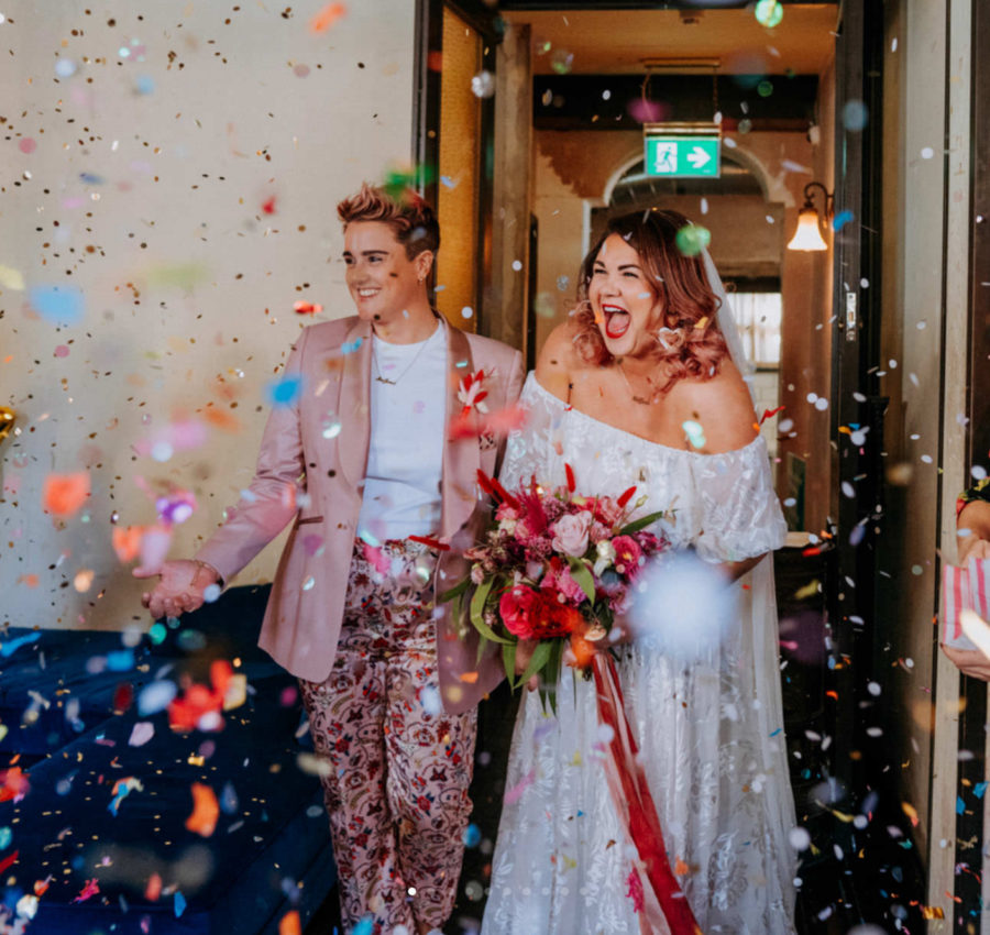
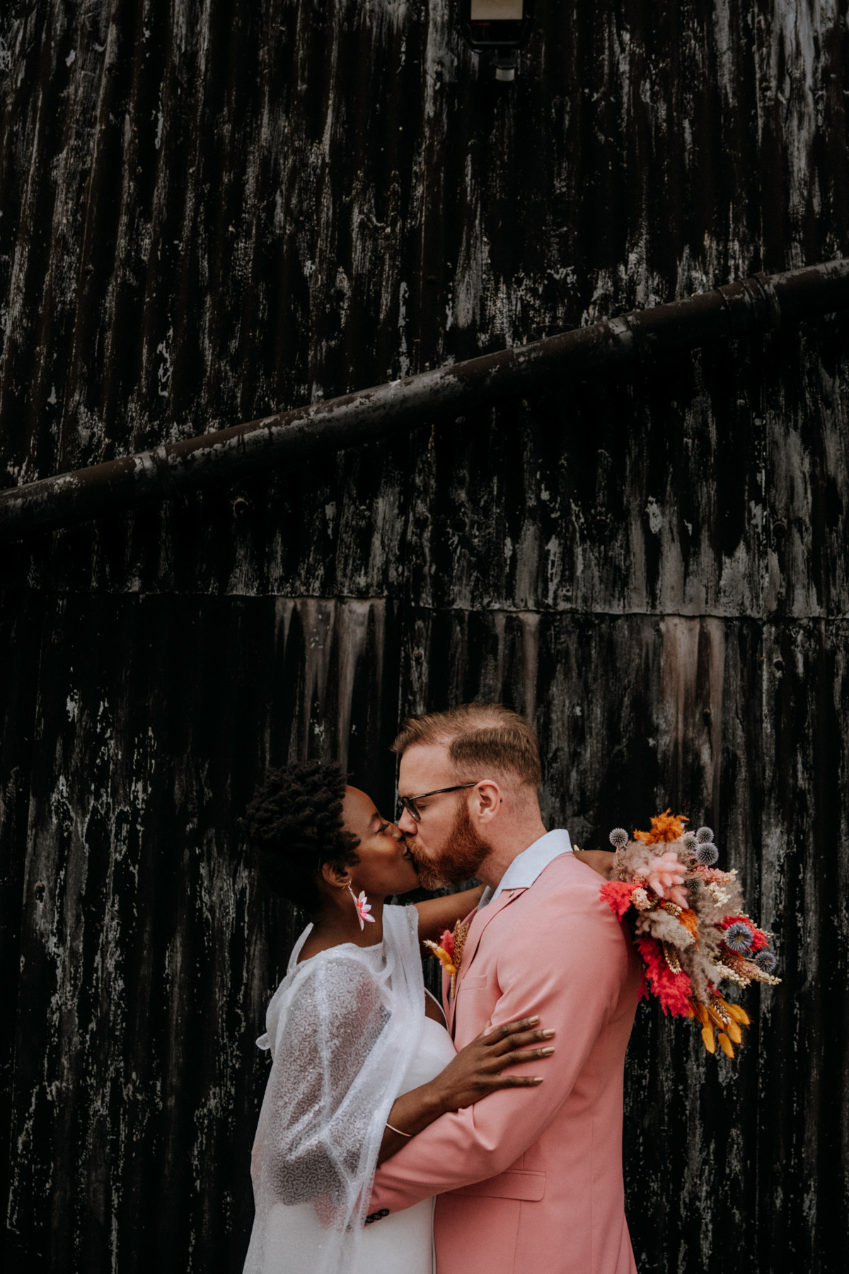
Stylish, bold and beautiful! Mixed metallics and mismatched coloured furniture are all the rave (literally!) in this fabulous festival style shoot. The purple, pink and silver palette is bringing nostalgic festival nods, and modern Coachella vibes the whole way…
URU suppliers Fleming Photo and Purple Door Props have also worked their magic on this shoot, alongside Kate from Foil Events who is here to tell us more…
Over to Kate…

What was the idea behind the shoot?
I wanted to create a fun, festival-inspired palette that still felt sophisticated and right for a wedding day. Sometimes alternative inspiration can feel too ‘out there’ so I enjoyed trying to find a balance between something non-traditional and something that couples could still see themselves having for their own big day!
Where did you get your inspiration from?
Festivals, especially Coachella and it’s style-focused counterparts, hence the little nods to festival style such as the fringing on the invites plus the stars and sequins sprinkled on everything!
How did you find the suppliers who made this concept come to life?
I’ve worked with Lex from Fleming Photo on numerous projects so we knew it would be a good collaboration between us again, I also love Jo Simner’s really bright, colourful floral style and Bronya’s willingness to always try new palettes and styles with her cakes.
Carly at With Bells On always nails it with a brief for stationery and has a really colourful and diverse repertoire, Emma from Sookrah has the most incredible festival accessories (I may already have one of her headbands in my collection!) and Leigh at Bustle and Bow stocks the perfect bridalwear that suits brides who want to have an alternative twist on traditional dress styles.
I’ve also been wanting to work with Vicky at Purple Door Props for ages, as she has the most incredible collection of colourful chairs which immediately bring a space to life. Your confetti are my go-to for confetti as is Kathryn at Streamadelica for streamers and backdrops – they make everything look awesome!
What details/look are your favourite, and why?
I enjoyed creating the balloon table runner/ decoration (although turns out they aren’t hugely practical if you want to have food on the table too!) and I loved the flower clouds Jo created, I always advise my couples to go for aerial installations over table decorations if they’re having to choose between the two, as they can be really impactful and won’t get lost in the crowds.
Do you have any styling tips for readers looking to emulate this shoot?
Lilac is a really popular pastel colour at the moment and looks set to stay into 2022, it works perfectly with mixed metallics which is what you want to be using for a festival/ holographic style. Also picking 3 key colours that you can repeat throughout will keep the scheme from feeling too chaotic, in this instance it was purple, pink and silver and then I just played around with different textures to bring it to life.
What is it that makes your inspiration unique?
It’s simple but still bold and colourful – it’s proof you only need a few feature elements to give your wedding an alternative twist.
What’s the most important tip you have for couples planning their wedding?
When it comes to styling, having a clear idea on your colour palette and inspiration early will make selecting your supplier team easier – often the décor is left to the last whereas a good vision from the outset will mean you have the right people to bring it to life for you!


Leave a Reply