
So much to love about today’s wedding inspiration… We have cute, modern bridal style, an abundance of big blousey blooms, and a fresh Summer colour palette that is warm and dreamy with pops of sunshine yellow and cotton candy pinks. Over to Katie from Unique Your Wedding to tell us more about the styling and the creative team behind the inspiration…
Katie From Unique Your Wedding…

Where did you get your inspiration from?
Inspiration for this Summer Haze shoot came from my love for warm sunny days and that true contented feeling you get from sitting out in the sunshine with your loved one. Feeling those warm rays on your skin, smelling the fragrant blooms in the garden, and spending time outside all day and into the evening is what summertime is all about for me, and so many couples who have a summer wedding.
How did you find the suppliers who made this concept come to life?
We have worked together on a few occasions now, and seem to understand each others creative ‘lingo’ to T, which makes putting these shoots together so enjoyable.
Do you have any styling tips for readers looking to emulate this shoot?
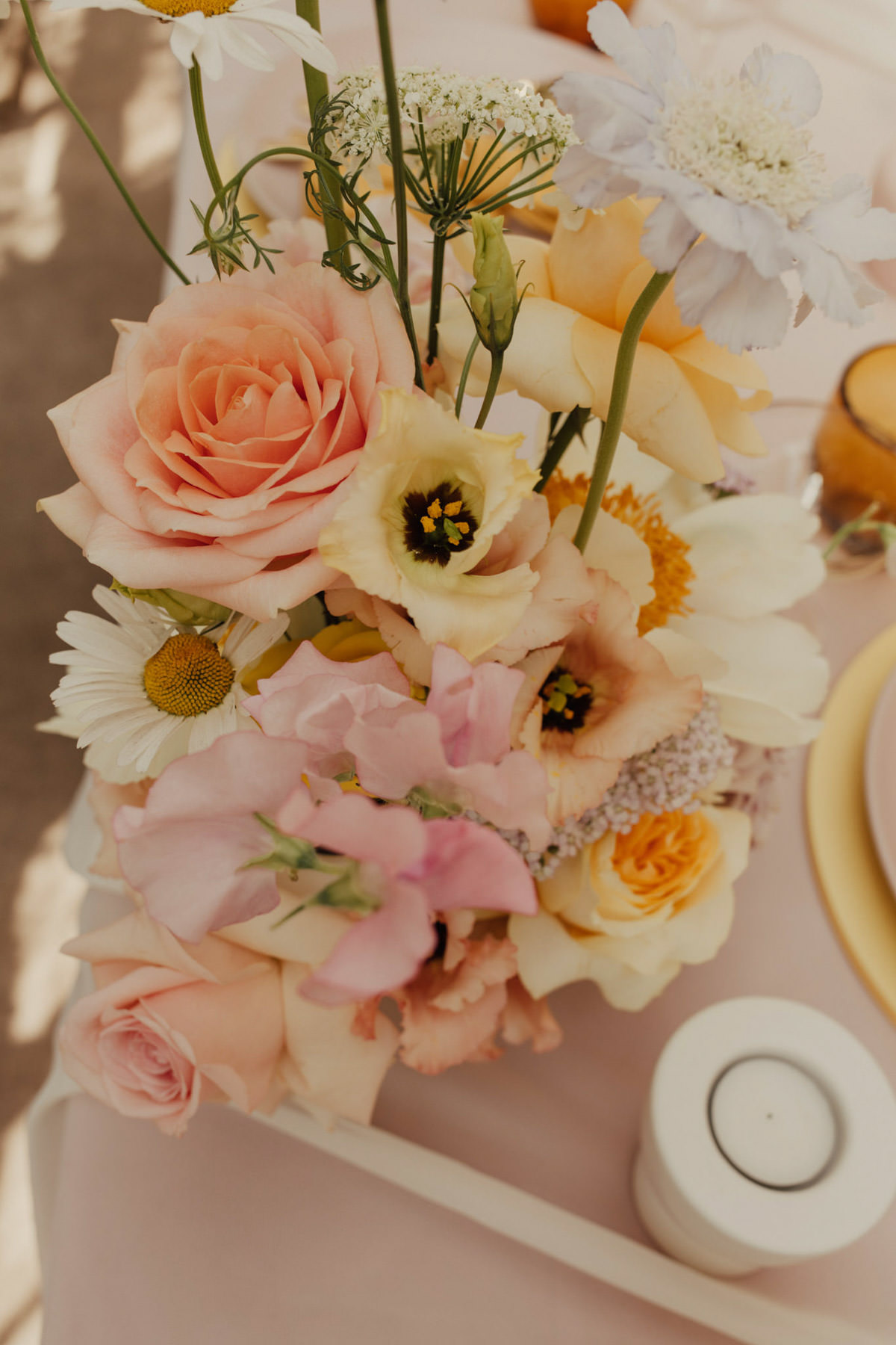
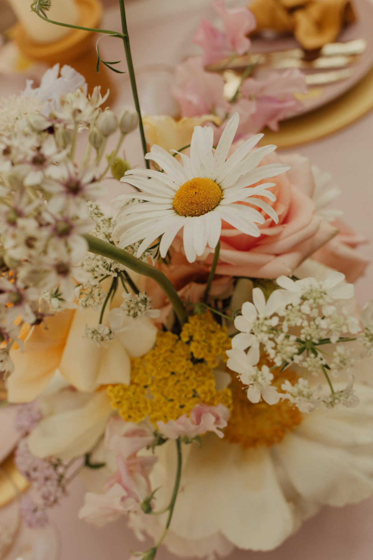
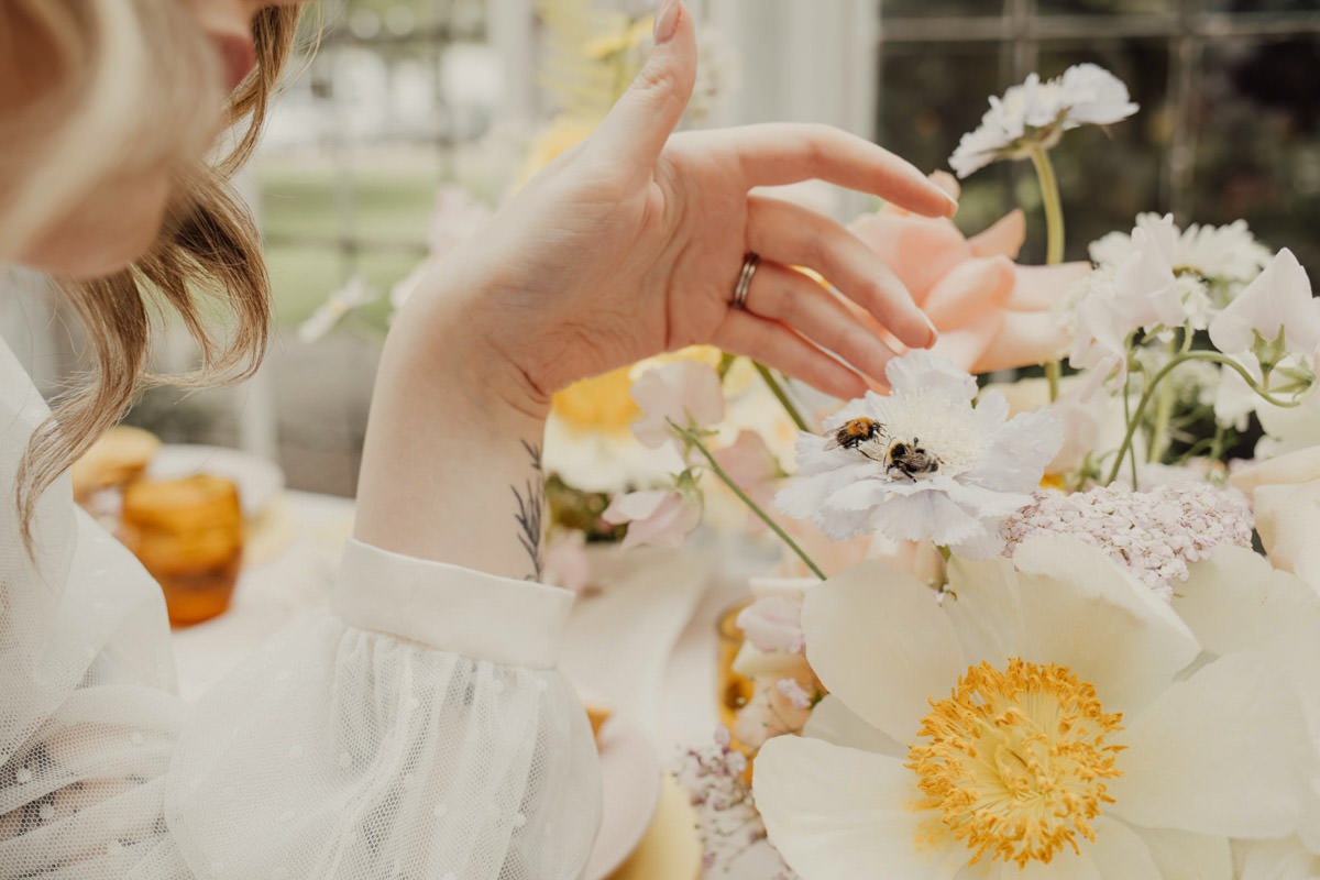
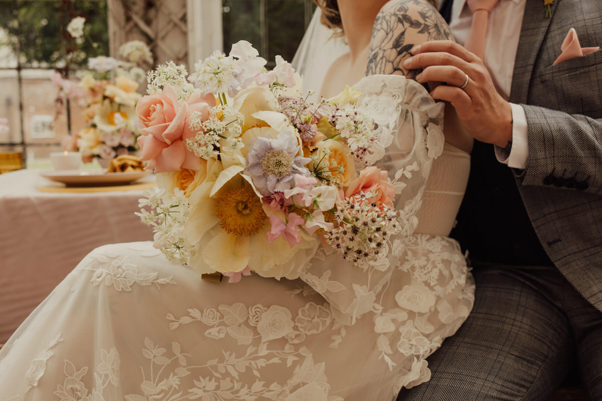
I knew florals were going to be the main feature of the shoot and I was immediately drawn to the beautiful Moonrise peony. It’s size is quite over the top yet it has a modern look, and it’s vibrant yellow centre is so eye-catching. I then wanted to have a contemporary playful colour scheme, so having the yellow with the cotton candy pinks was the right amount of bright, without being too daring for a bridal look.
I feel like couples are a little scared of using lots of colours for their wedding day, and there is always an abundance of inspiration for neutral, blush and green floral palettes, so I was really passionate about showcasing more colour. I think inspiring couples to think a little out of the box or encouraging even more colour to their wedding day is something to be celebrated and explored more. I have certainly seen an influx this year with couples wanting to use brighter colours into their designs, and as a creative person, this is so exciting! Maybe this attraction to colour is due to Covid and the difficult year we’ve all had, or maybe they have just been drawn to colours and the happy feelings you get from them. Certain tones and colours are a definite mood changer, and this vibrant yet subtle summer palette is super fresh yet really dreamy and warm looking.
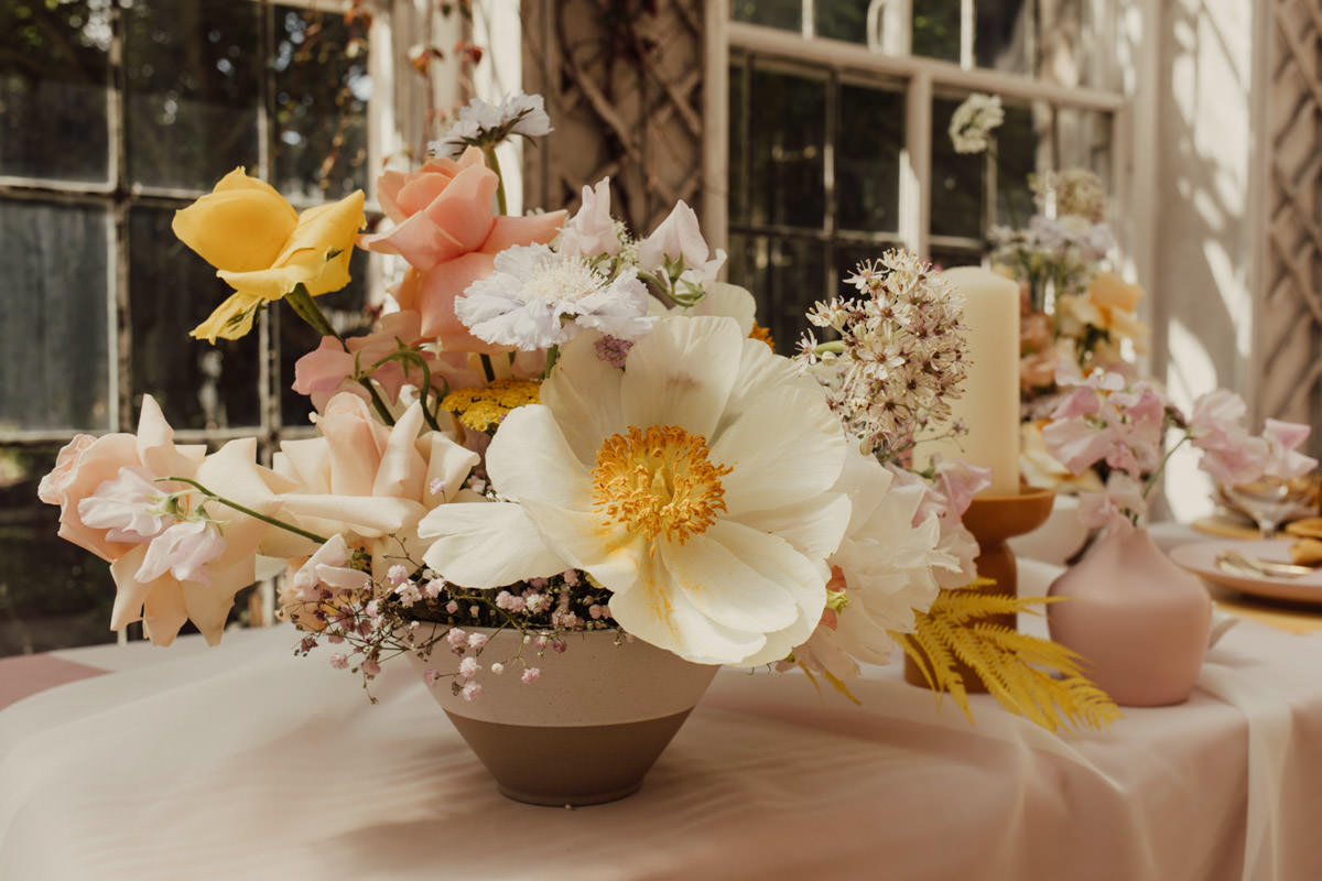


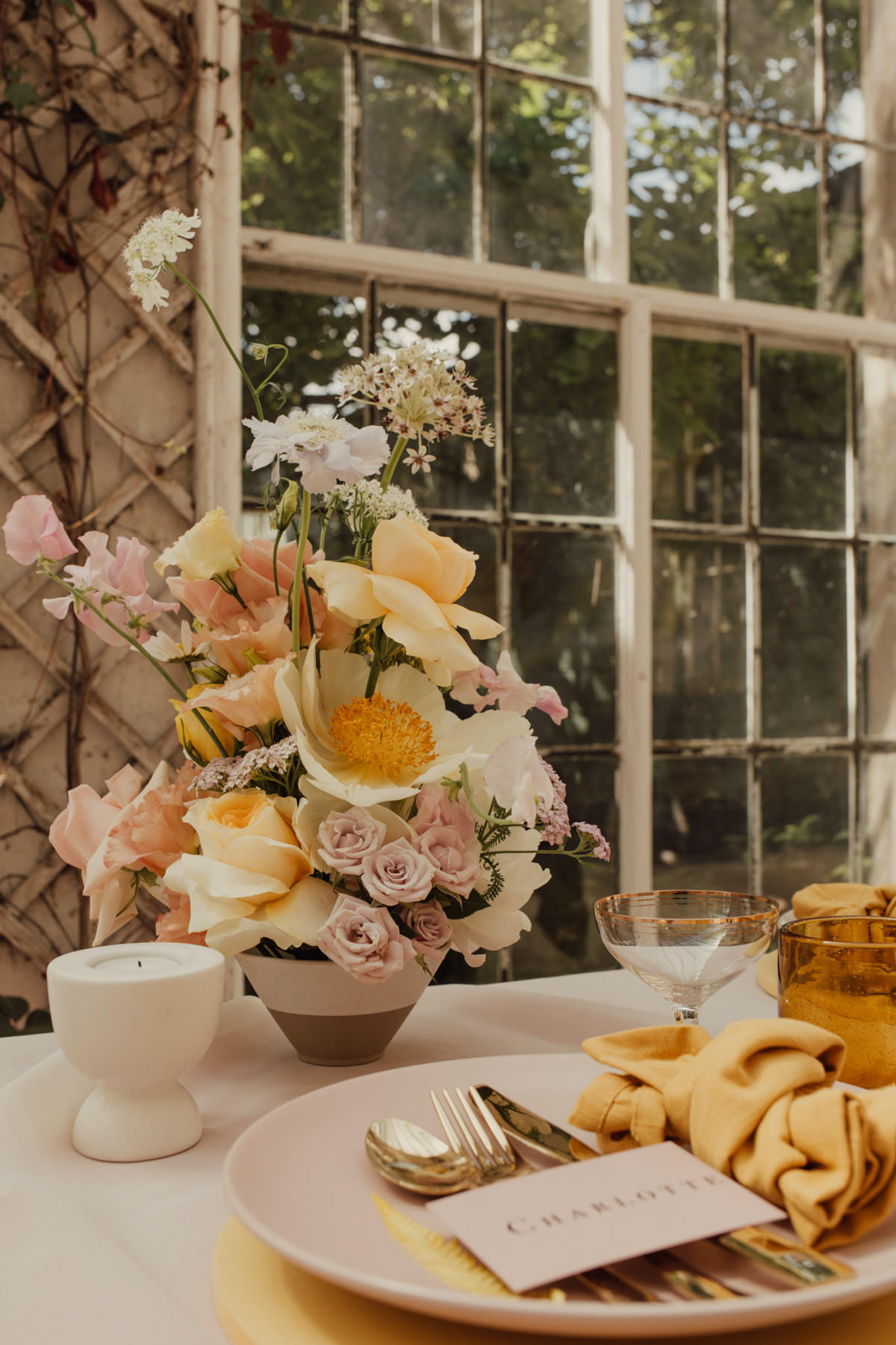
Abigail from Petal and Paper said” The moodboard for this shoot was so colourful yet in a subtle way, a real summer palette! It’s really lush to incorporate the palette into the stationary without overpowering it, to allow the other elements to shine. I opted for a tonal blush to offset against the yellow and gold, and it created the dreamiest of table settings.”
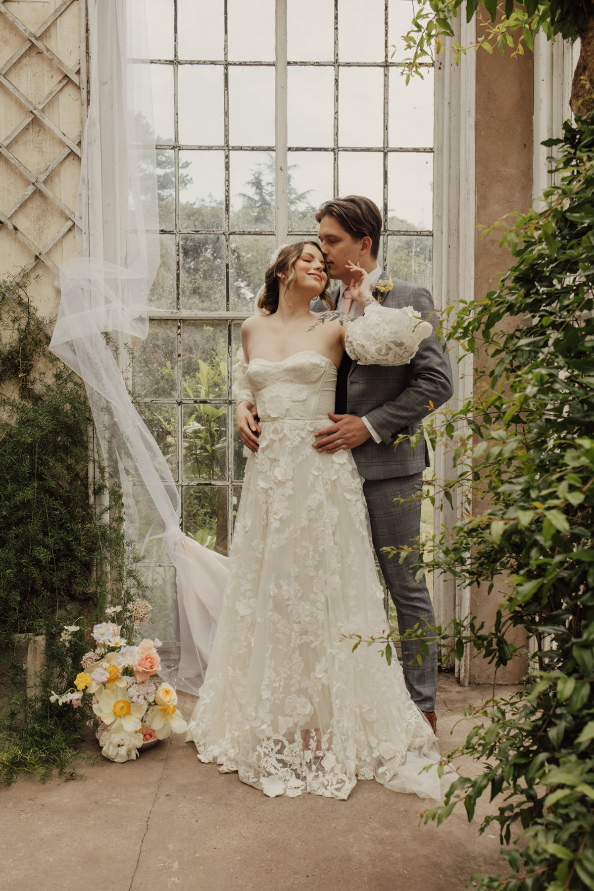
The layers within the tablescape from the modern differing heights of flowers and candles, to the different textures in the ceramics, cake and fabrics all help create a welcoming place to finally sit alongside family and friends comfortably and joyfully! Soaking in the summer rays through the windows of the Orangery, cheersing with champagne, and reminiscing of summer days gone by. The relaxed layout with the trestle tables and benches also encourages less formal style which lots of couples are preferring lately. The untraditional wedding set up is always something I enjoy creating, and the Orangery at Bishton Hall was the perfect space to create an unweddingy wedding look. Concrete floors, bare brickwork, unpainted window frames all work perfectly for a contemporary wedding, and this harsher environment only needs a few modern fabric drapes and key pieces of furniture placed in the venue’s focal areas to make it pop. As Emma the photographer said “OMFG those windows need a swear word! Floor to ceiling vintage style sash windows are a dream for all Togs , and for stylists and floral designers, they give you the perfect backdrop for any arrangement or tablescape.


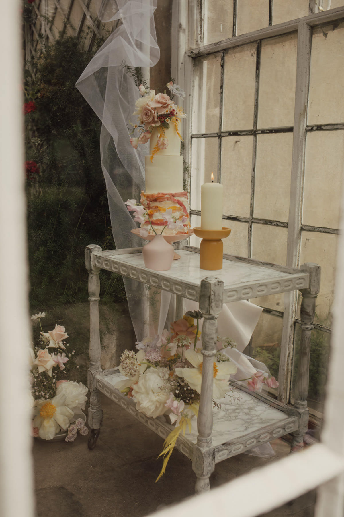
Heather from TSP Cake said “Inspired by the beautiful summer flowers of Katie’s moodboard, I wanted to create a fun colourful cake. I designed a ruffled ribbon base and added a watercolour effect to add movement. I wanted the flowers to sit on top so as not to interfere with the ribbon details, I also thought it had a nod towards the beautiful floral hair designs of Freda Kahlo but with a very bright british summer palette.”
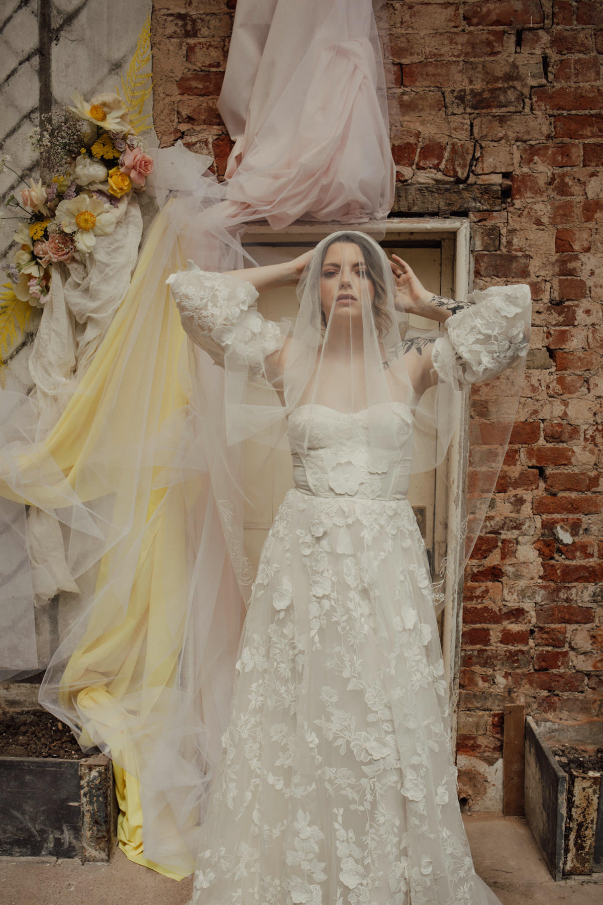
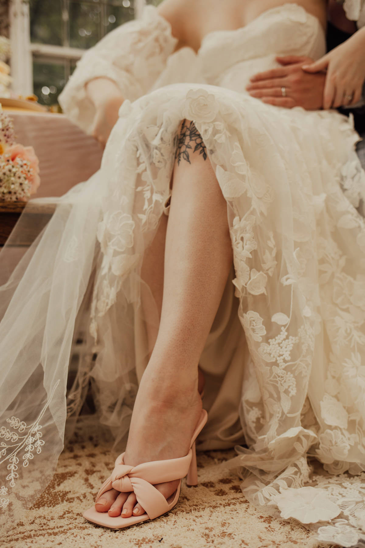
Overall we wanted a real ceremony to party, day to night, classic to fun element to suit today’s more versatile modern brides. Linking the florals and beautiful textures of the tablescape and venue was really important so we chose the Betula dress from Susanna Greening Design. This has a tulle lace dress with delicate floral embroidery embellished with 3D flowers. It’s a really feminine modern look with a fitted, strapless bodice, full skirt with a train, and optional voluminous sleeves. The contrast against the modern suit from Platts Menswear works so nicely as well. It’s called Jerry and it’s a grey and pale blue check by Marc Darcy.
Marilyn’s makeup included a natural base of Dior, with a Charlotte Tilbury and Natasha Denona eye in the soft peach, and Fenty beauty for her skin to achieve a really natural soft look which again works perfectly for the day to night look, and especially important in the hot summer months.

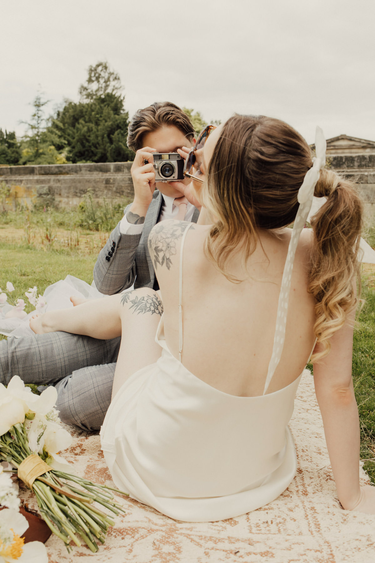
The second look was Bay from In The Name Of Love, a mini silk slip dress which is perfect for an evening reception look or a more relaxed and fun daytime dress, we got some really fun shots with this look, and it’s so versatile to layer up with a cape or veil, or just on its own as a wedding picnic or party dress.
The final look used Blush from In The Name of Love Bridal, which is a polka dot tulle sleeved top, we paired this with a tulle skirt from SGD to create something really soft and feminine which was perfect for the movement shots we wanted to get. It was lovely for In the Name of Love Bridal and Susanna Greening Designs to work so closely together to create these summer looks.
We chose to use a veil within some of the daytime looks as we are really seeing an increasing trend for veils at the moment, and I think they add so much interest and movement to a bridal look. We used bespoke designs by Rebecca Anne, with her double tier Fleur from the Wildflower collection which has the most beautiful large flower embroidery, and the cape is a bespoke piece called Rose. These 2 accessories again helped to achieve a strong day to night, ceremony to party look , with us teaming the more traditional over the face veil with the Betula dress, and the cape with the Bay slip dress.
Rebecca said “Both modern designs worked well for the editorial aesthetic. The cape is an extra wide design for lots of ‘light’ play. We went with a longer veil for the flowy fabric to work in with the draped fabric in the set up. The florals on both worked well with the summer brief.”
What is it that makes your shoot unique?
A modern couple and vibe, in a grade II* Georgian setting.
What’s the most important tip you have for couples planning their wedding?
Stay true to yourself


Leave a Reply